Specialising in treatments that are low in toxicity but are highly disruptive and inhibitors of tumours, iOnctura mission is to enhance patient quality of life and prolong the healthspan of those going through treatment. Ultimately giving more time, for the moments that matter.
The brand identity reflects how iOnctura's treatments are using pioneering small molecules that can have a big impact on the patient wellbeing. Not only positively impacting their lives, but the lives of those around them.
A brand with heart
iOnctura's belief is that every cancer patient deserves hope.
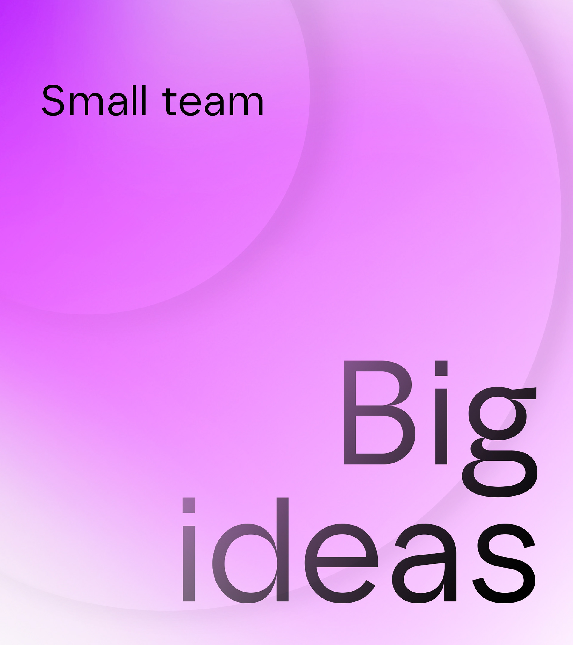
Their mission is to develop high impact, low disruption therapies
that extend the healthspan for patients.
Their mission is to develop high impact, low disruption therapies
that extend the healthspan for patients.
The enlarged letter 'O' is emblematic of this mission and a key part
of the overall visual identity. A simple and powerfully iconic wordmark that is
reflective of the positive impact iOnctura aims to have on patient's lives.
of the overall visual identity. A simple and powerfully iconic wordmark that is
reflective of the positive impact iOnctura aims to have on patient's lives.
A visual identity system with impact
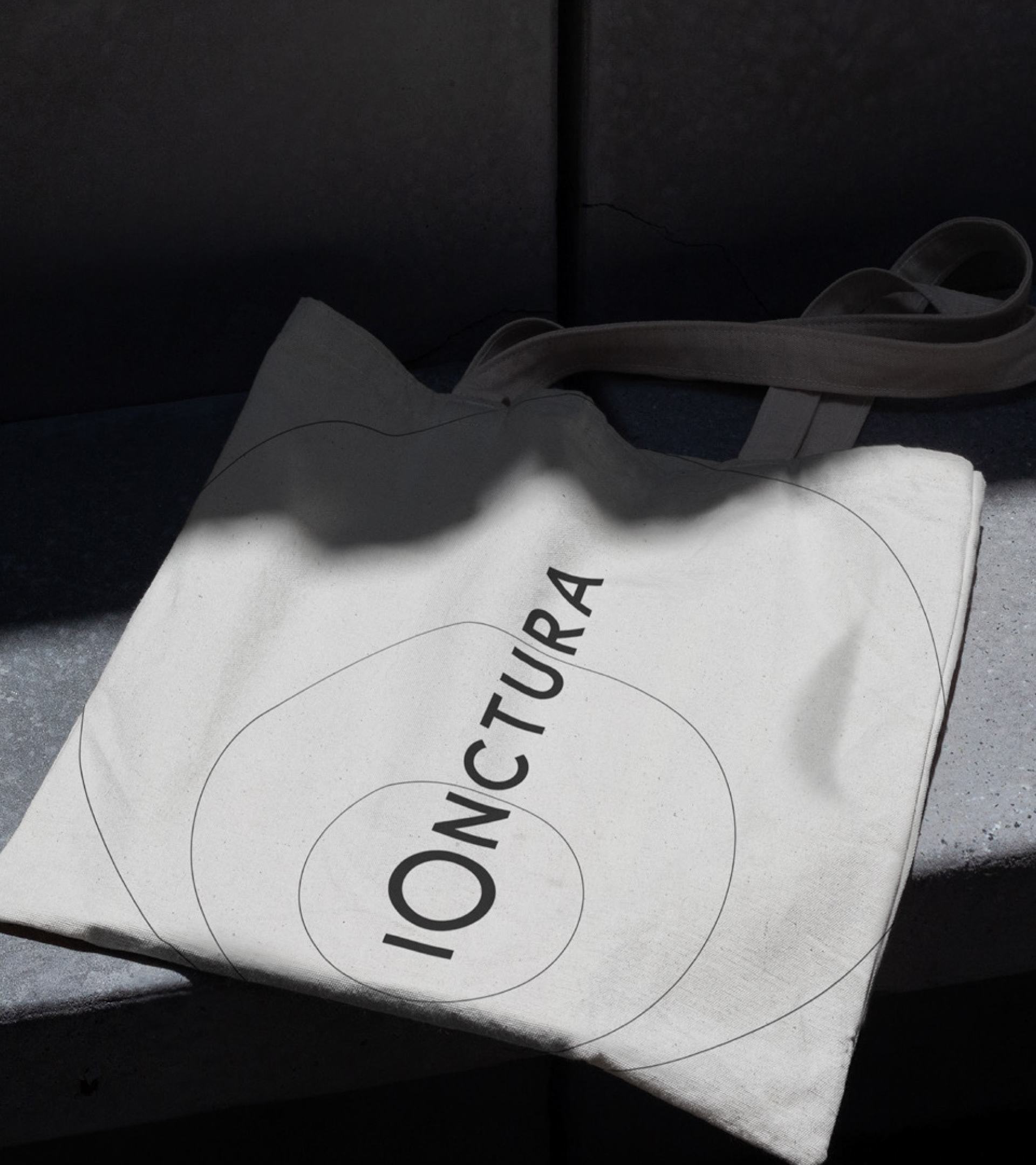
The ripple effect graphic is born from the heart of the iOnctura wordmark.
A dynamic system that brings to life iOnctura's mission of high-impact,
low disruption therapies across the all applications.
low disruption therapies across the all applications.
Designed to be flexible and work with photography,
typographic and infographics, across all levels of communications,
from high impact campaigns to lower-level channels.
typographic and infographics, across all levels of communications,
from high impact campaigns to lower-level channels.
Typography that reflects the brand
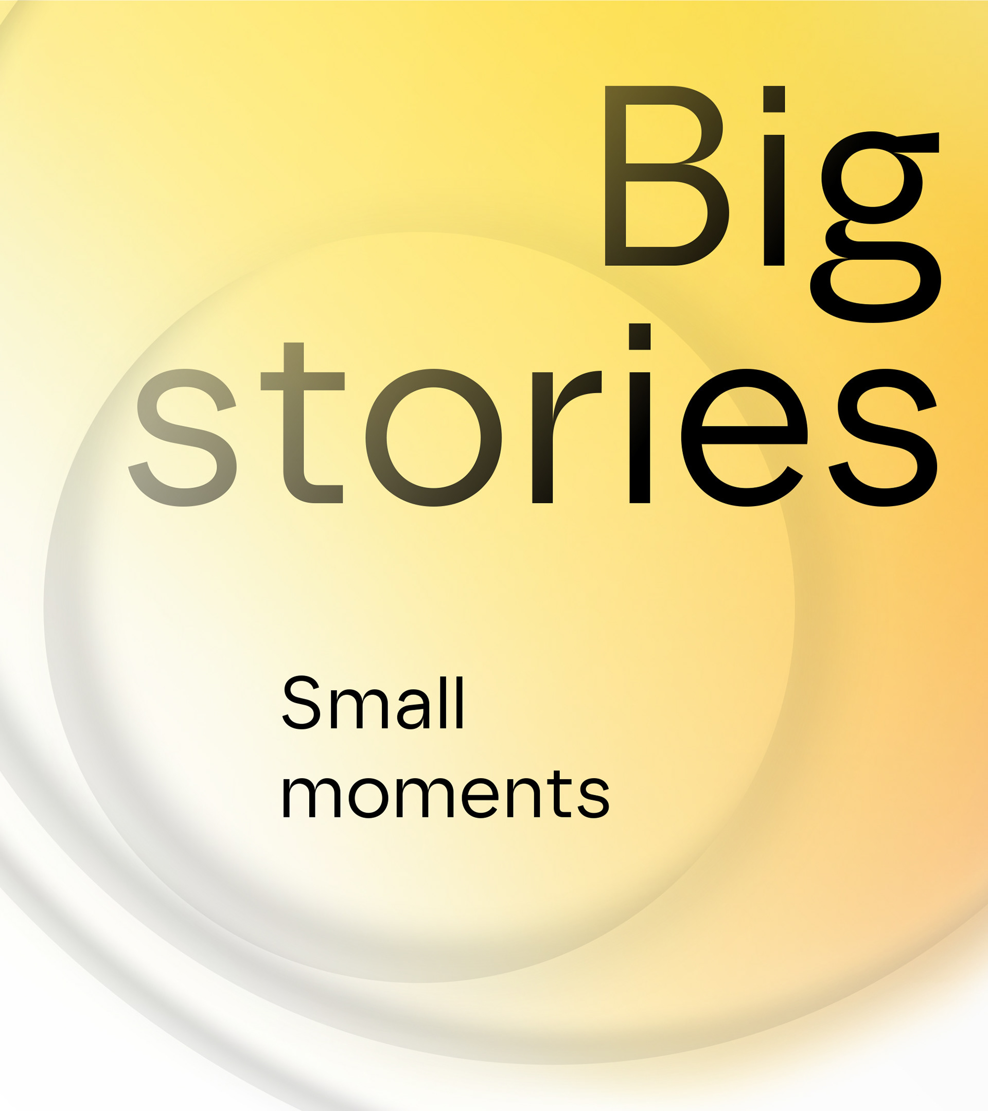
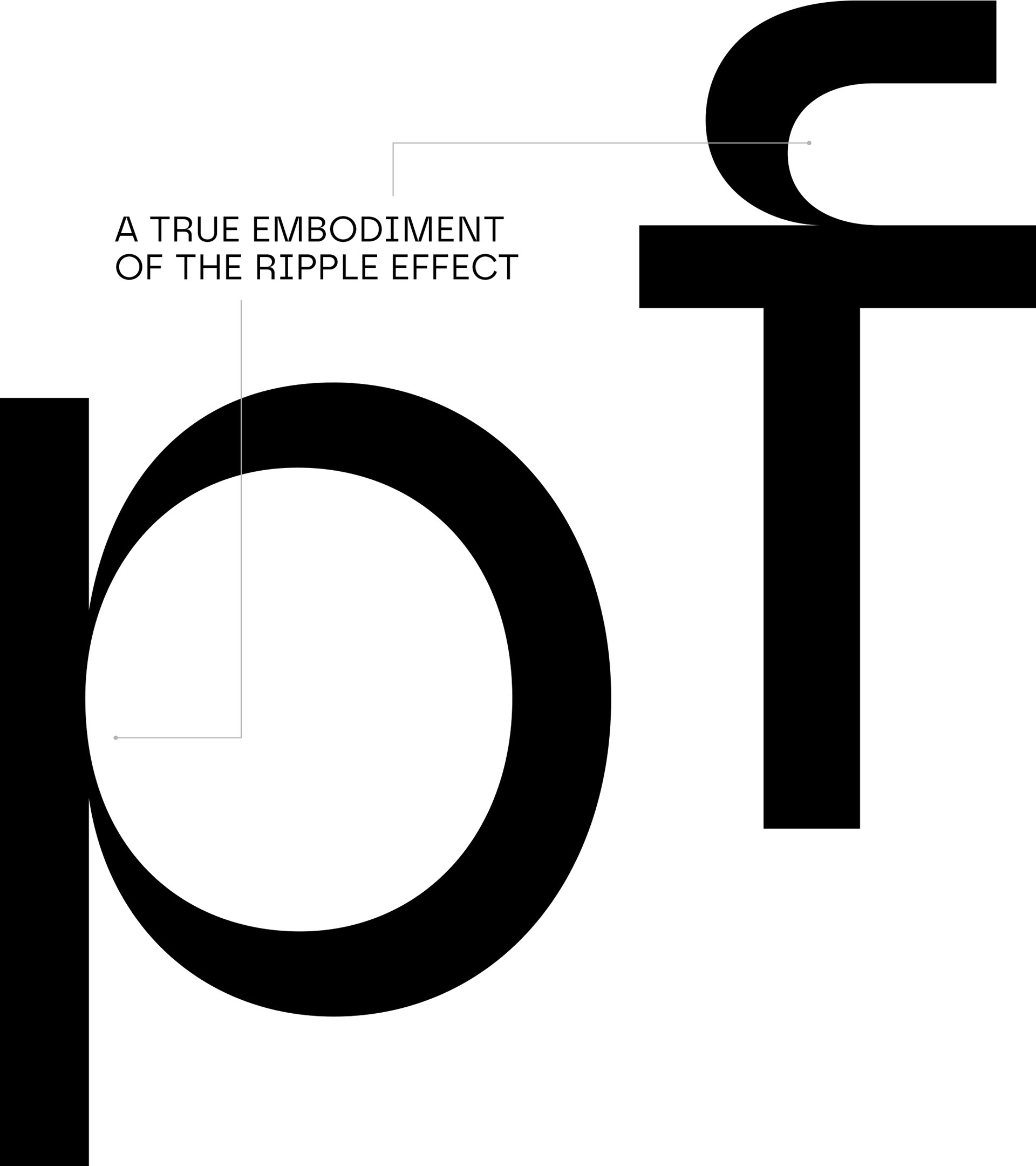
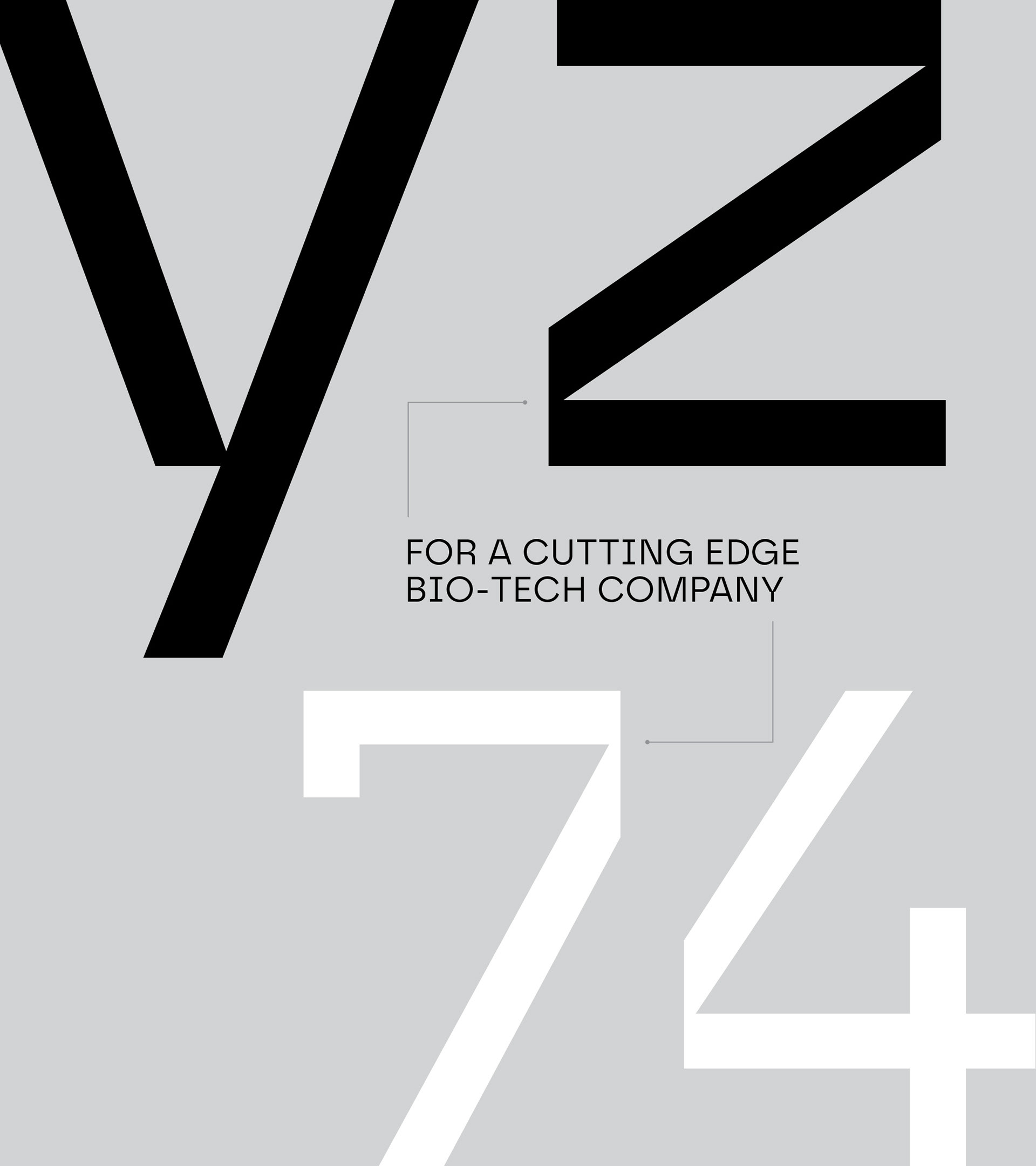
The Safiro typeface plays a key role in iOnctura's visual identity
with letterforms that embody the ripple effect.
with letterforms that embody the ripple effect.
A sans-serif font that brilliantly showcases iOnctura's values
as a modern, scientific and precise brand.
as a modern, scientific and precise brand.
Colour that feels positive
As a bio-tech, iOnctura wanted to be seen as a positive and human company.
Focused on the vibrancy of life and celebratory in the precious time we have
with family and friends.
Focused on the vibrancy of life and celebratory in the precious time we have
with family and friends.
This colour palette is bright and colourful, representative of bright futures,
while also being precise, focused and scientific.
while also being precise, focused and scientific.
Gradients bursts add a sense of life and energy, complimenting the ripple graphics.
Iconography that works in unison
Complex data, scientific terms and treatment names can be hard
to communicate to a broader audience.
to communicate to a broader audience.
Using the circles from the ripple graphic as a starting point, the iconography style
aims to clearly articulate these complex subjects, while working in unison
with the visual identity.
aims to clearly articulate these complex subjects, while working in unison
with the visual identity.
Felt across all channels
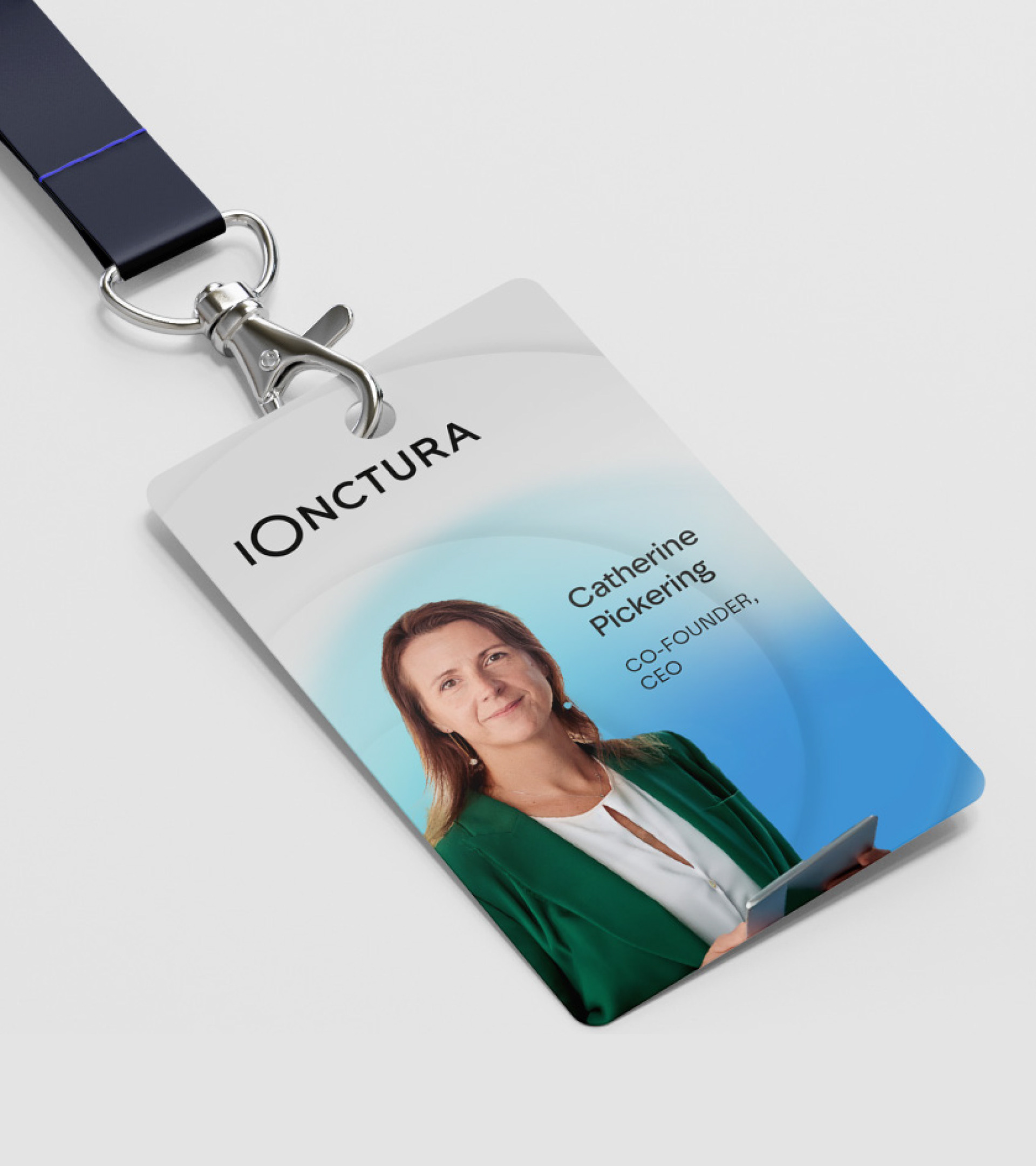
As part of the brand rollout, a series of assets were designed to help the
iOnctura team communicate to their audience. As the brand grows,
these continue to evolve as iOnctura's reaches more people.
iOnctura team communicate to their audience. As the brand grows,
these continue to evolve as iOnctura's reaches more people.
Digital experience breathing new life into a brand
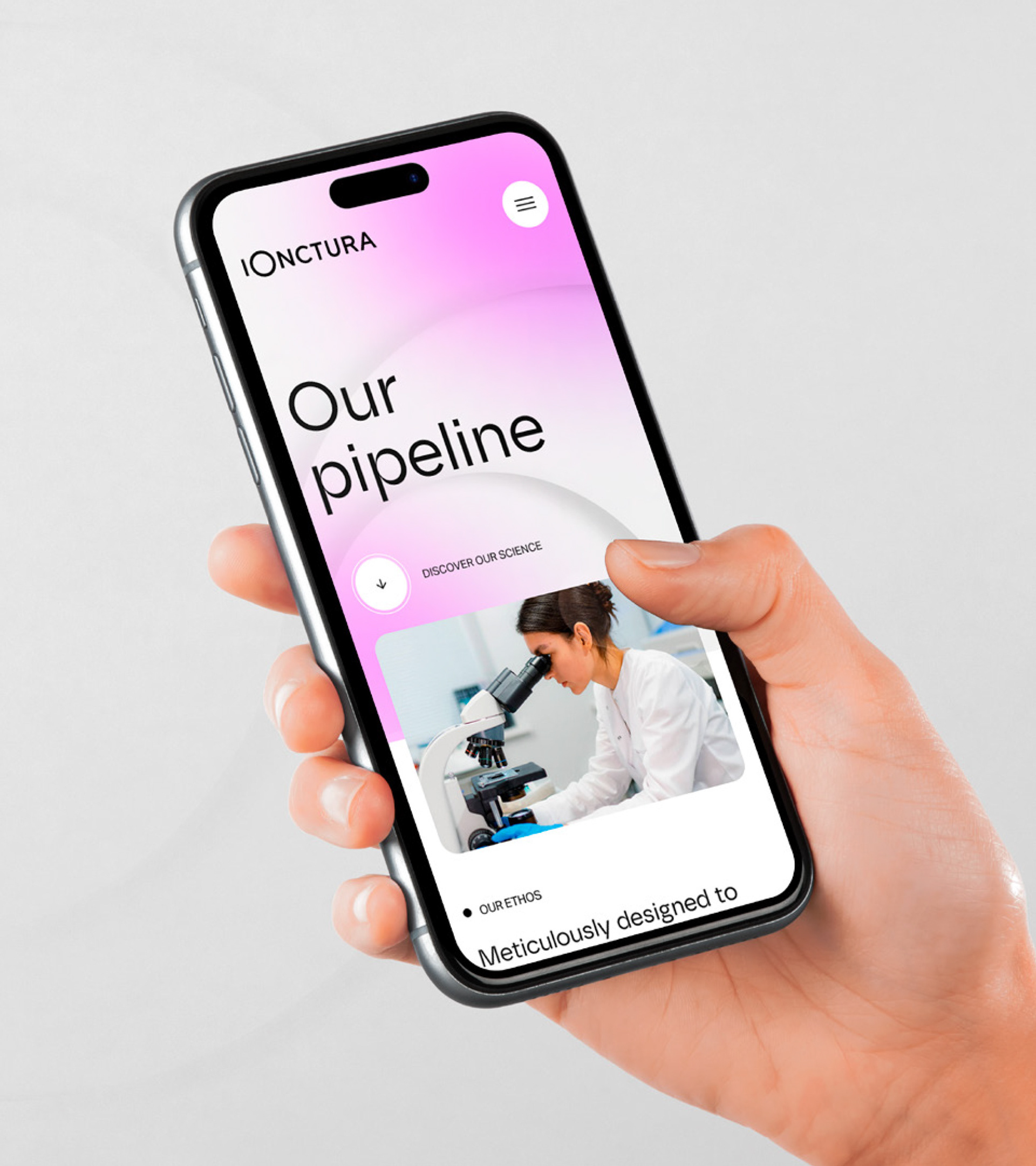
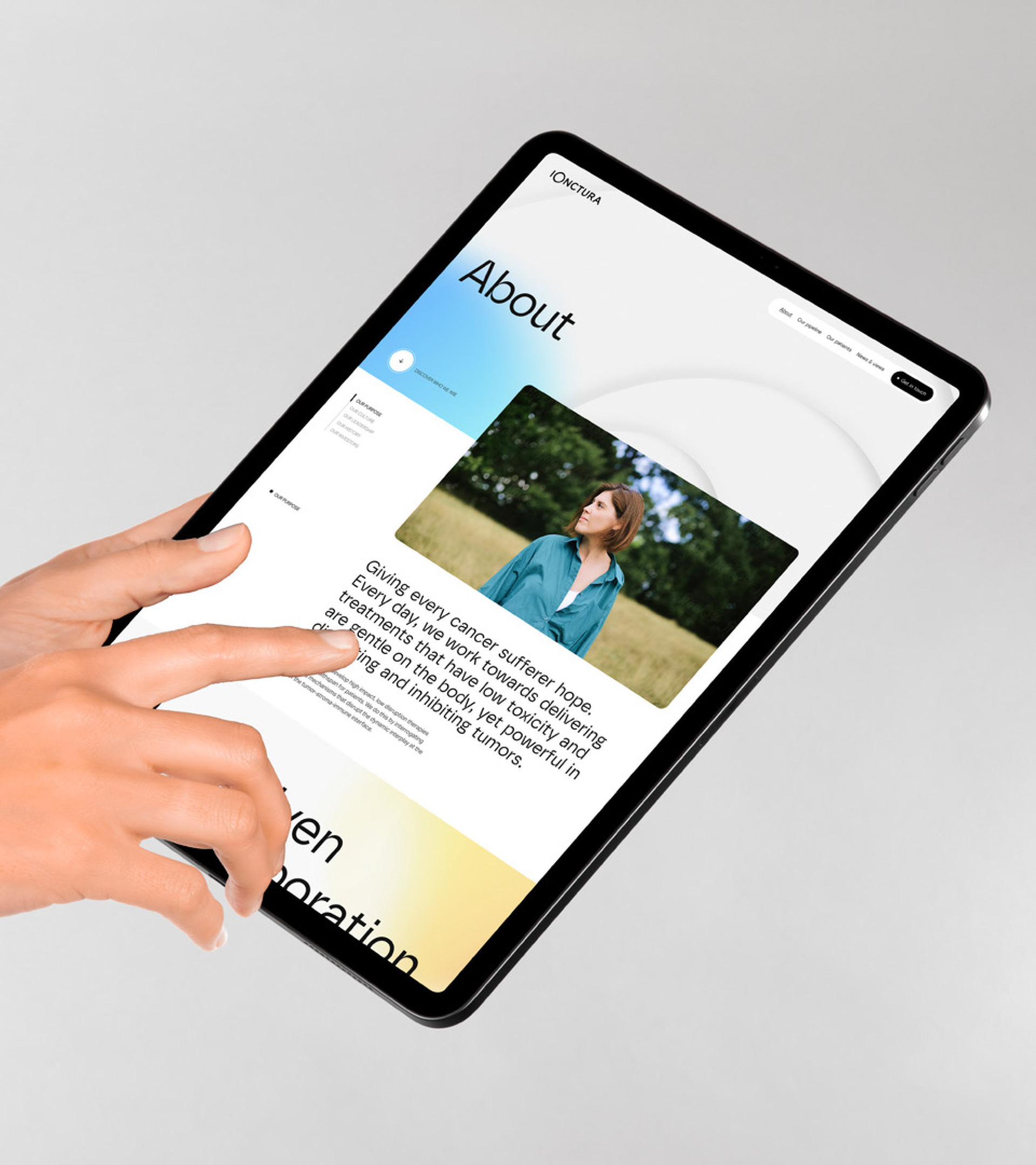
As the main channel for the new visual identity to be showcased, the digital experience needed to introduce the world to iOnctura's mission.
Designed in collaboration with three thirty studio and Freelance Digital Designer
Louis Saville, the website is a perfect example of how the digital format can tell stories
and capture the essence of a brand.
Louis Saville, the website is a perfect example of how the digital format can tell stories
and capture the essence of a brand.
The landing page engages with a pulsating and interactive element and draws
the viewer in and connects them with the brand and all it stands for.
the viewer in and connects them with the brand and all it stands for.
SEE IT THE SITE IN ACTION:
iOnctura.com
iOnctura.com
