The challenge
As part of Radley Yeldar's brand offer, Fit for Purpose is an initiative that measures and understands how well brands are walking the talk. By taking a companies purpose statement and measuring it up against everything they do: from communications, culture and sustainability, to business strategy and performance metrics. Radley Yeldar have produced a vast amount of data that lists the best performing companies, through to the worst. The index is there as showcase of RY's brand knowledge and how they can help your business.
However, this is RY's 4th year of research, and purpose has become noisy and a lot of agencies are talking about it. With so much noise around it, purpose is becoming ‘purpose-wash’. Some even say that purpose is dead. However, for our approach, we wanted to prove otherwise.
However, this is RY's 4th year of research, and purpose has become noisy and a lot of agencies are talking about it. With so much noise around it, purpose is becoming ‘purpose-wash’. Some even say that purpose is dead. However, for our approach, we wanted to prove otherwise.
The approach
With the wealth of data and analysis that RY have produced, and clear evidence to showcase the benefits of integrating purpose into your business, we very much believe that purpose is far from dead.
Bringing data to life
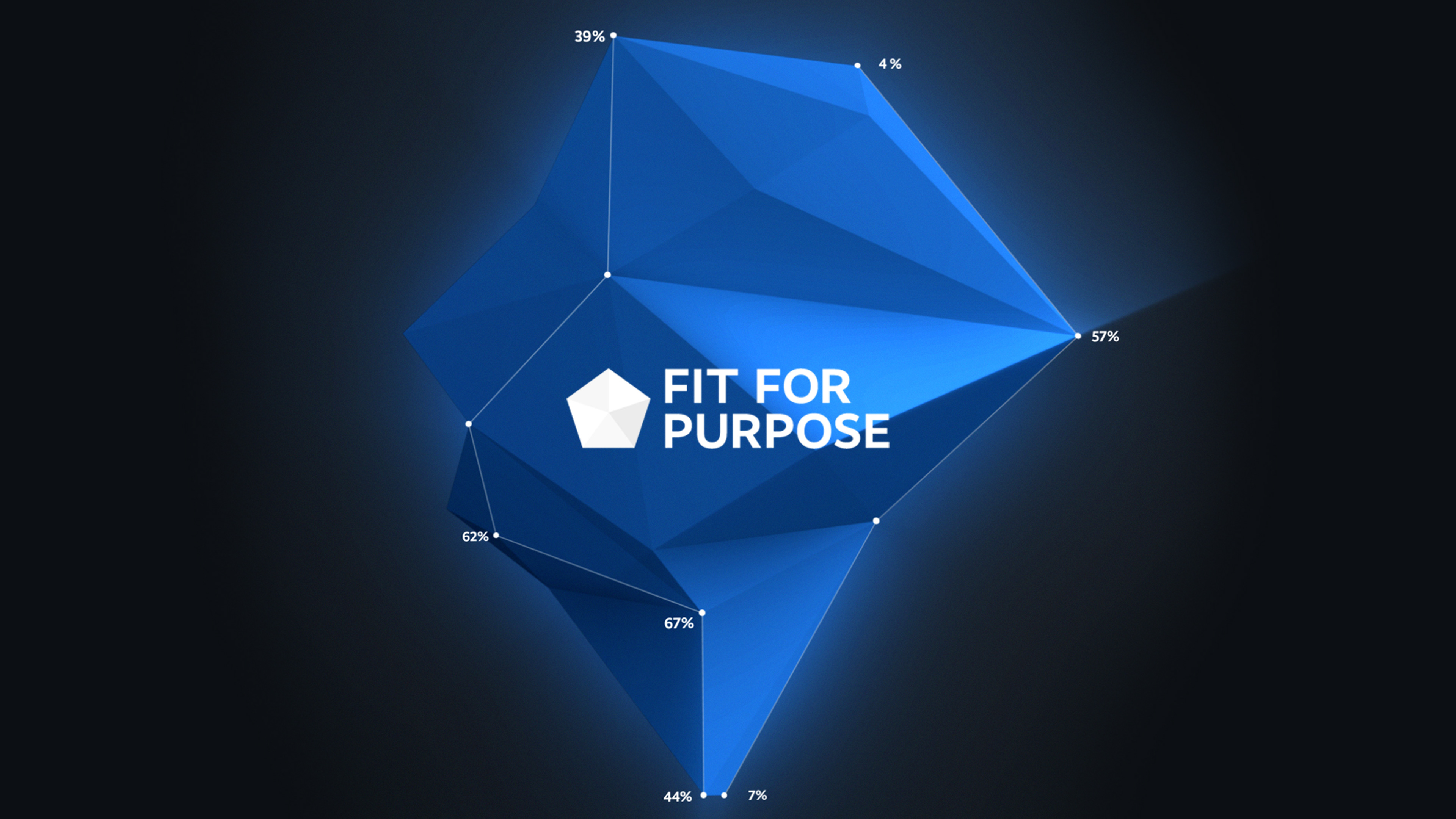
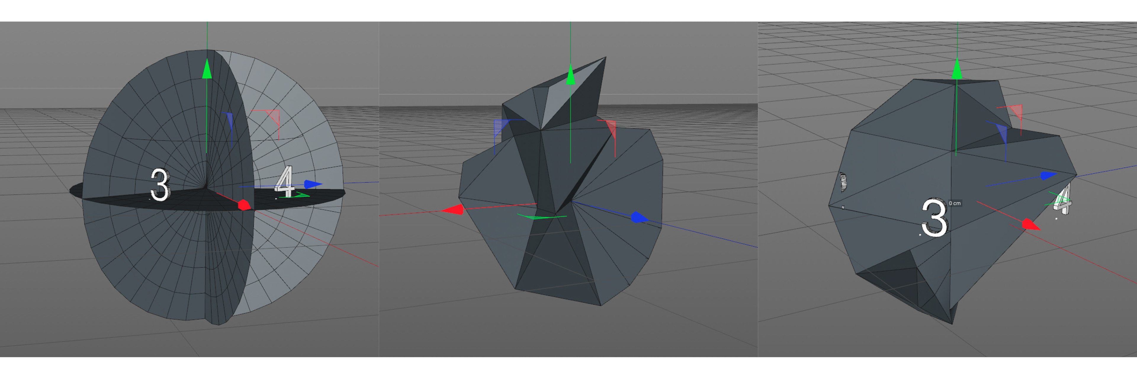
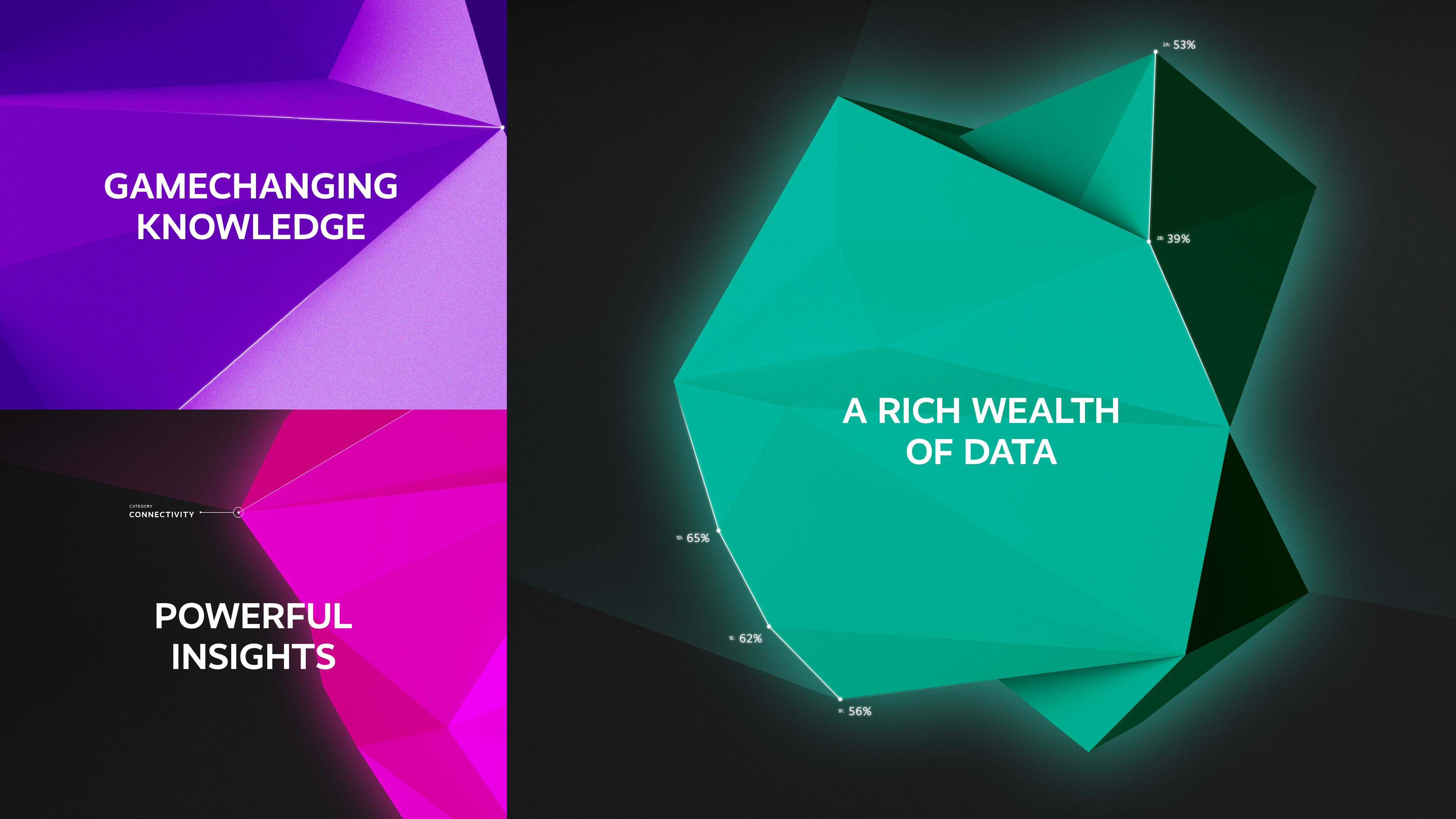
Taking the data from the research, we generated 3D visualisation of the top 10 most purposeful companies. This showcases the wealth and depth of information that RY have produced, and that embarrassing it and understanding the insights to be gained from it, can have a positive effect on your business.
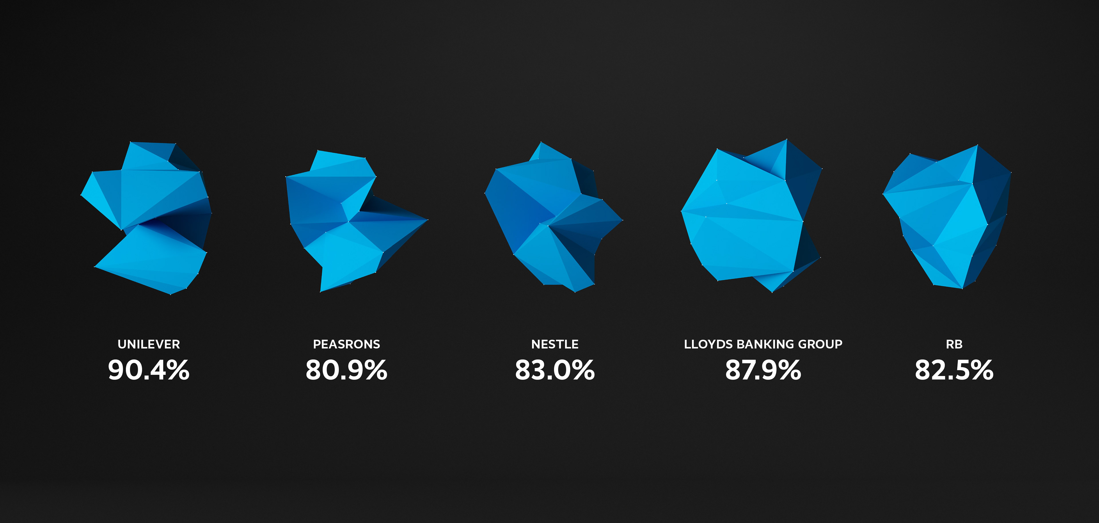
Using the 3D generated data visualisations for the look and feel, we created an intriguing campaign that defied the feeling around purpose and hero'd the idea that the data is very much out there and the benefits are to be gained from it.
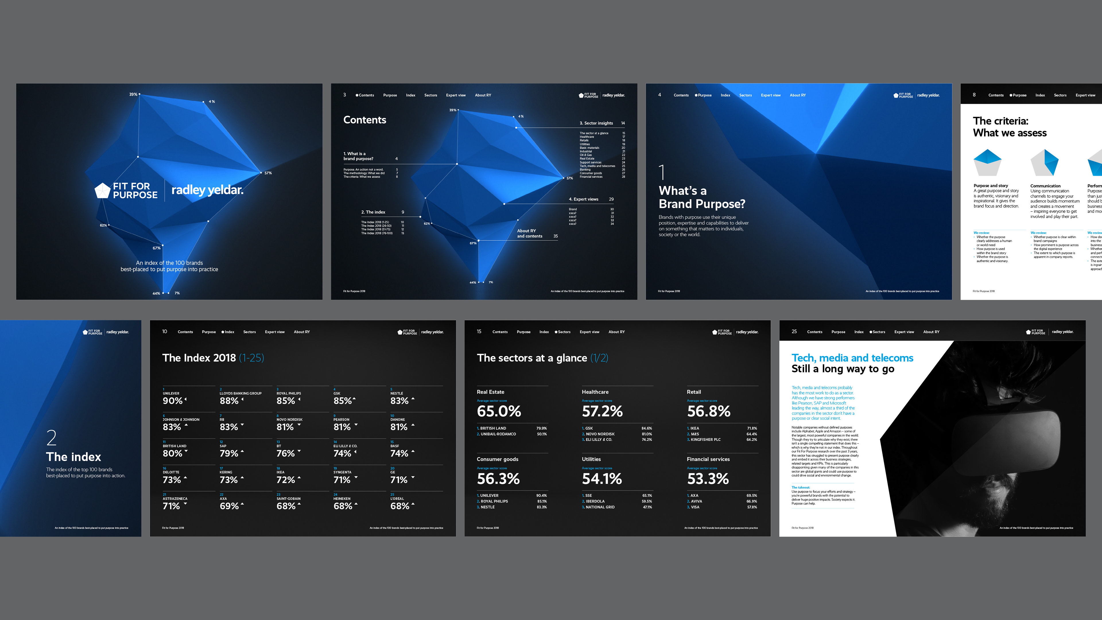
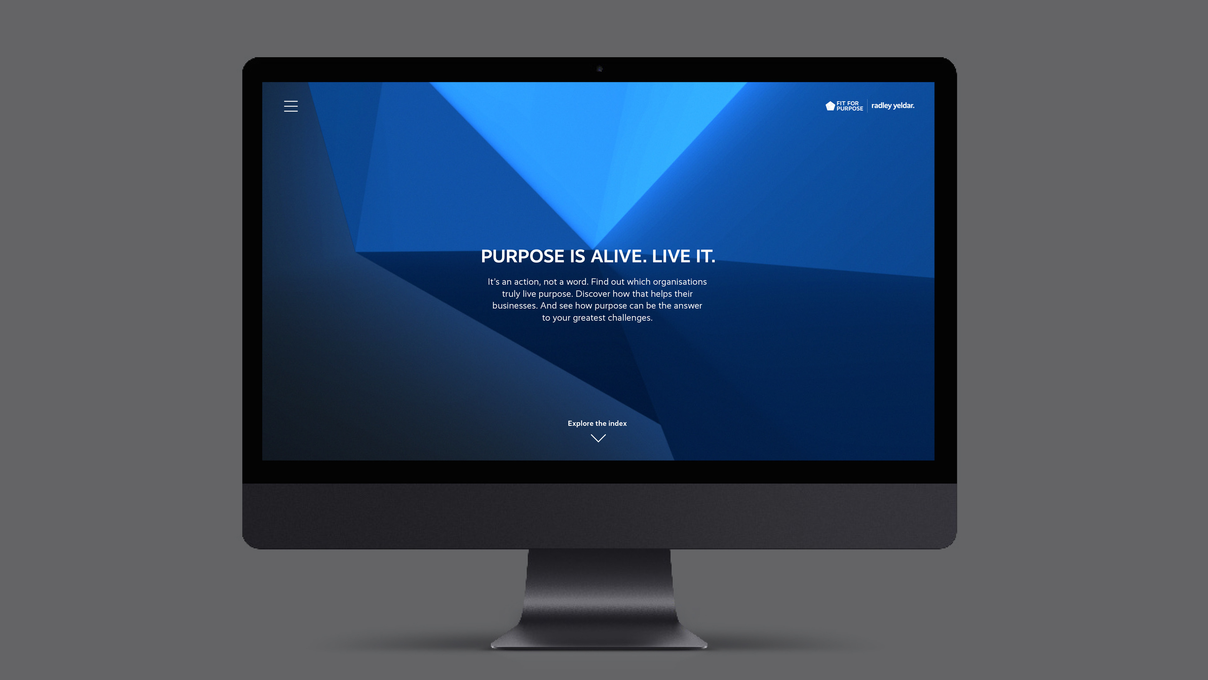
An interactive experience
The campaign also was a driver to bespoke website
that showcased the top 100 most purposeful companies.
that showcased the top 100 most purposeful companies.
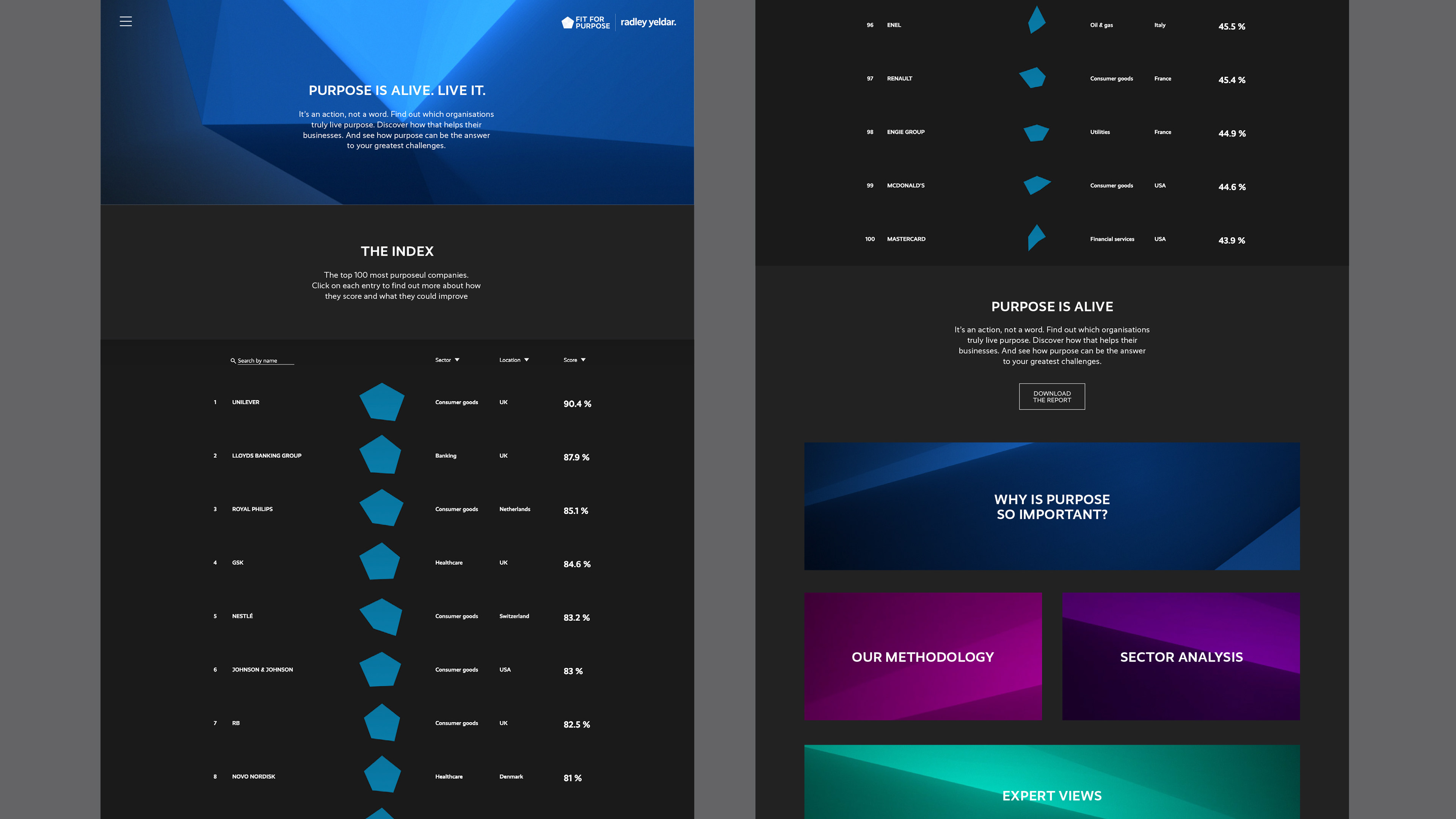
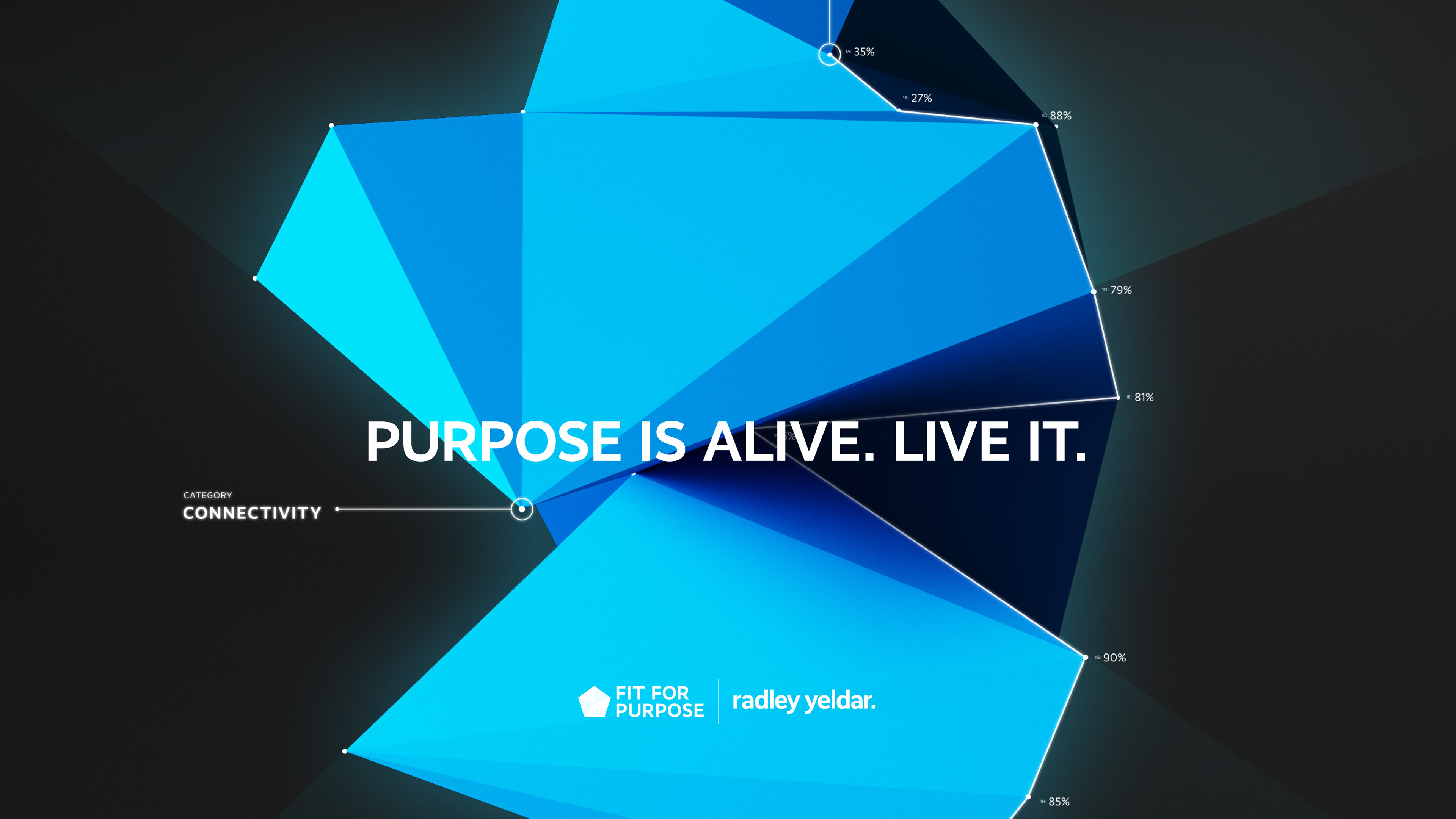
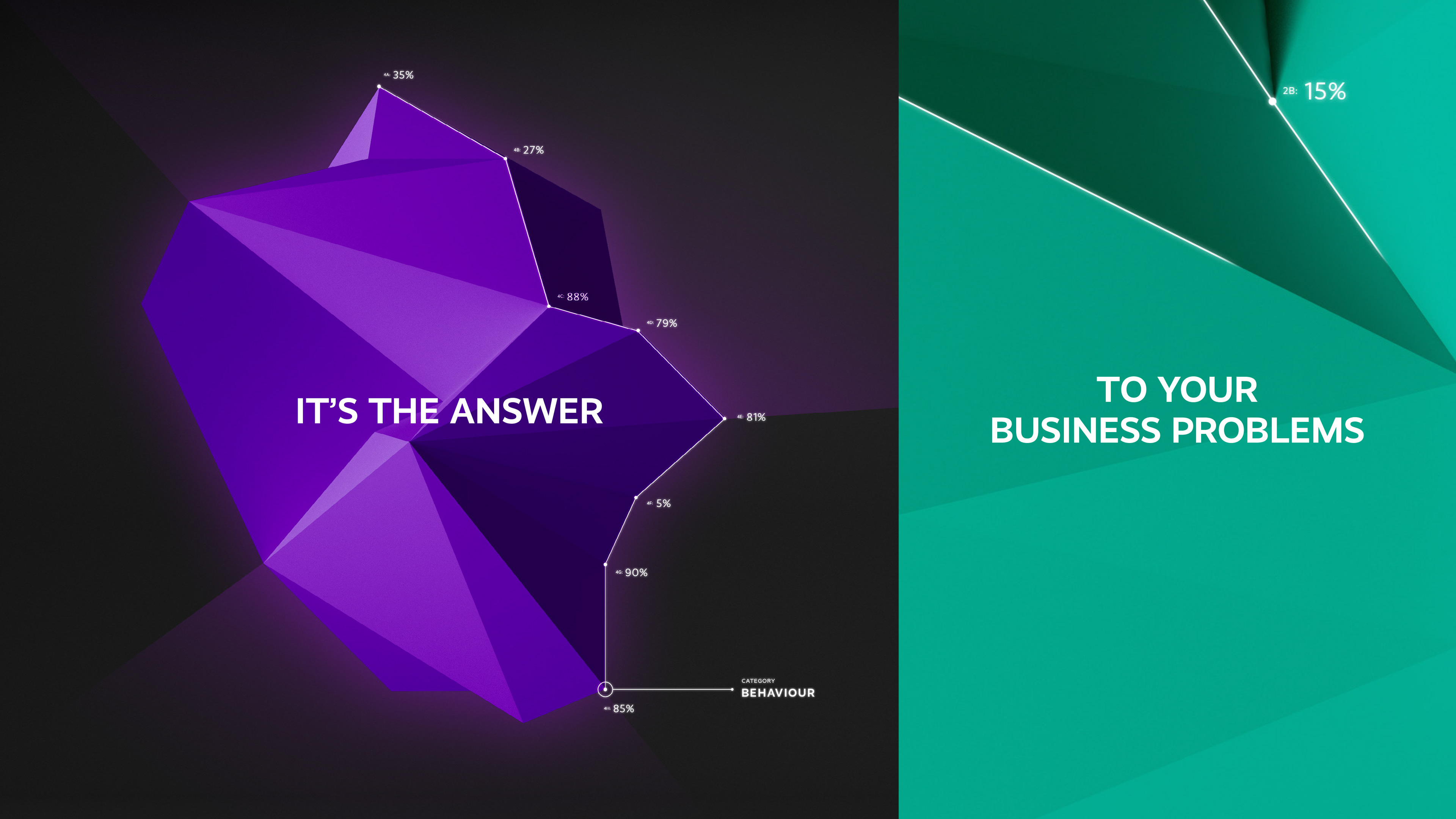
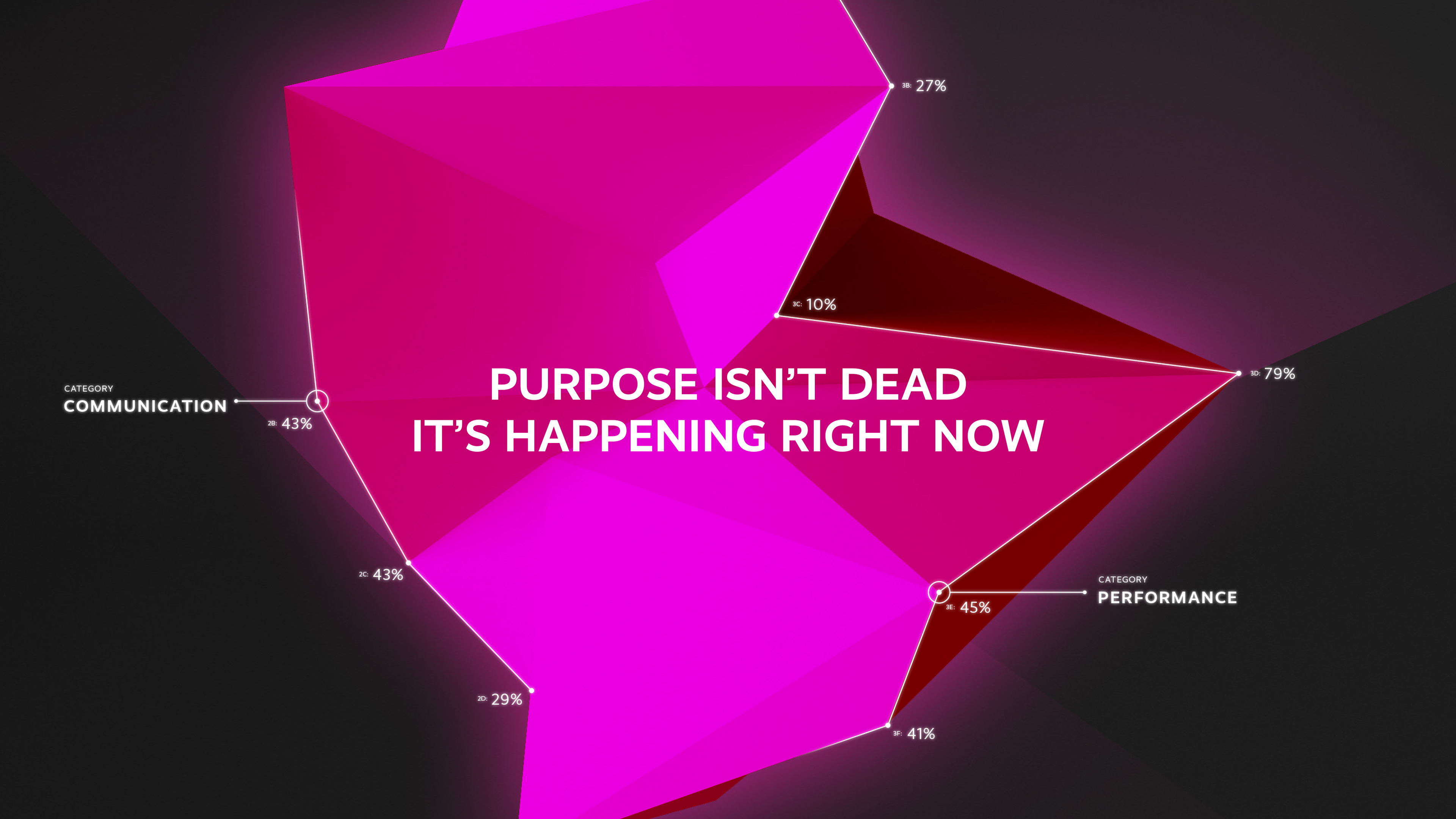
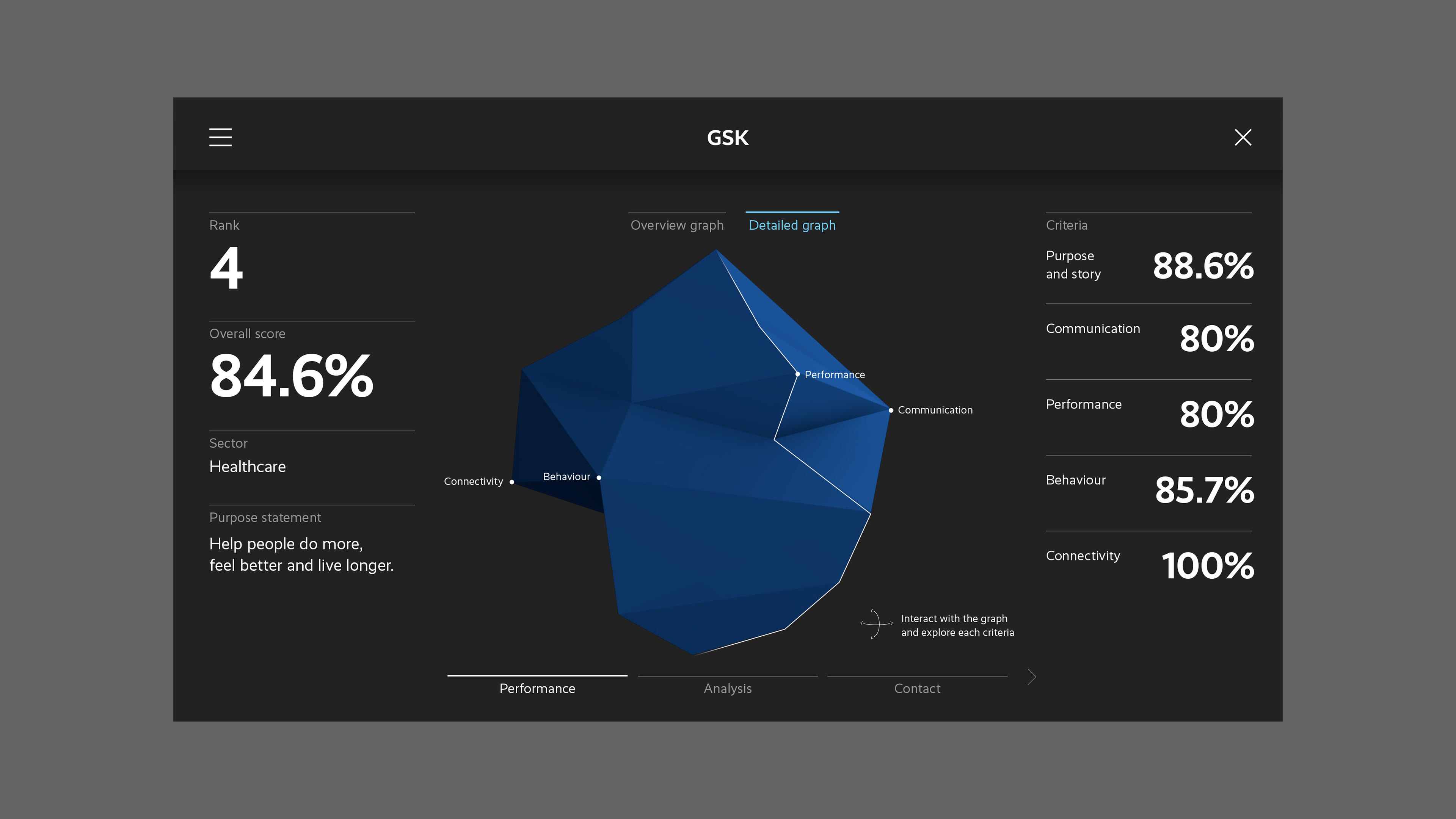
All 100 companies features a simply graph, which when clicked on opened a dashboard experience. In each dashboard, the user has the company's purpose statement and how their overall score was broken down via the five categories. The user also has an option to select previous year's data and a sector average to see how they compared.
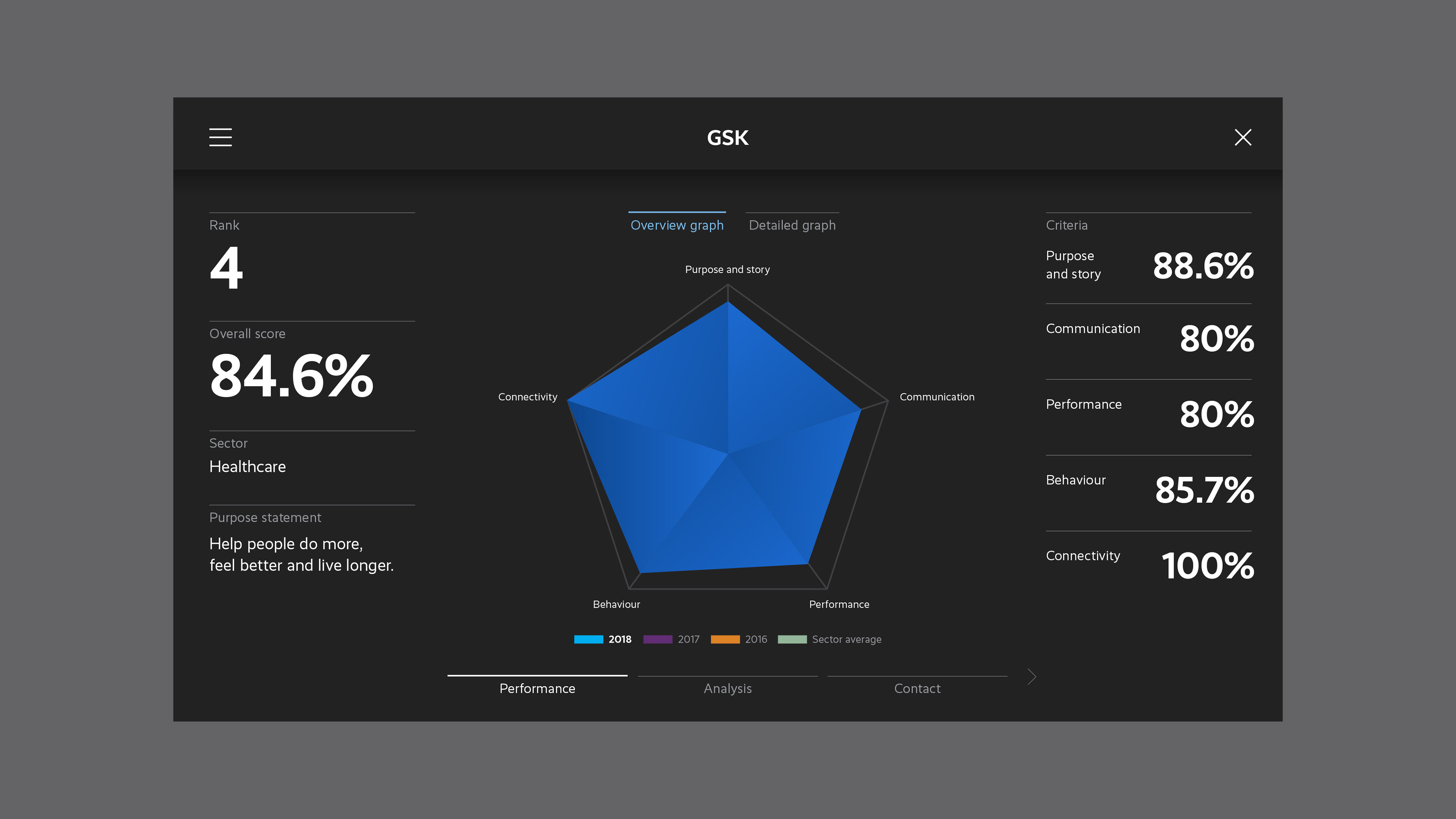
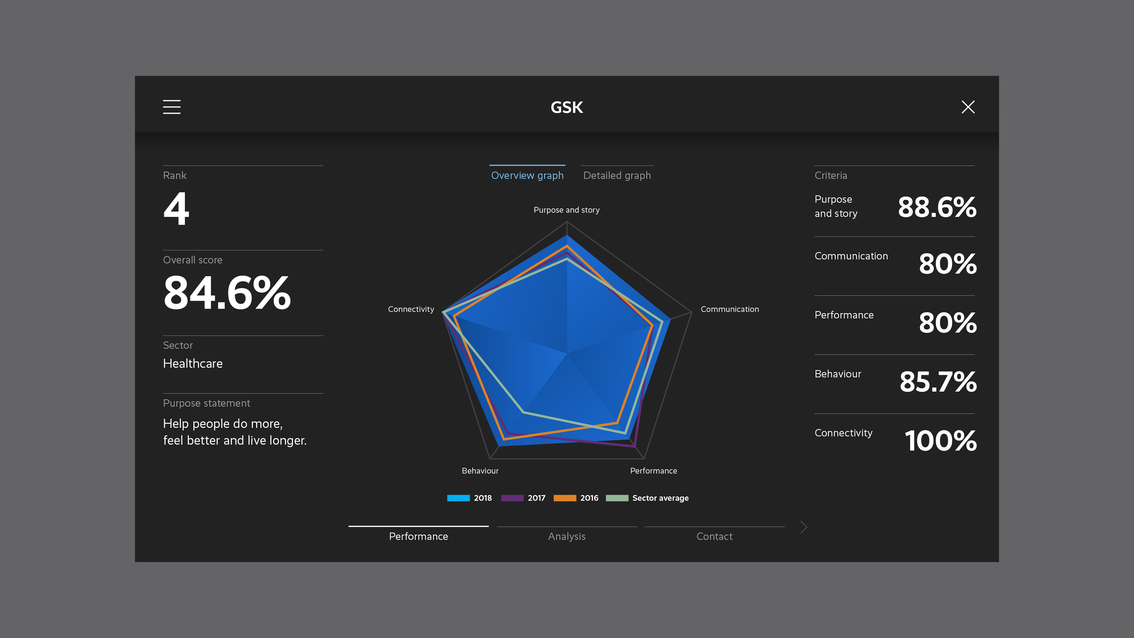
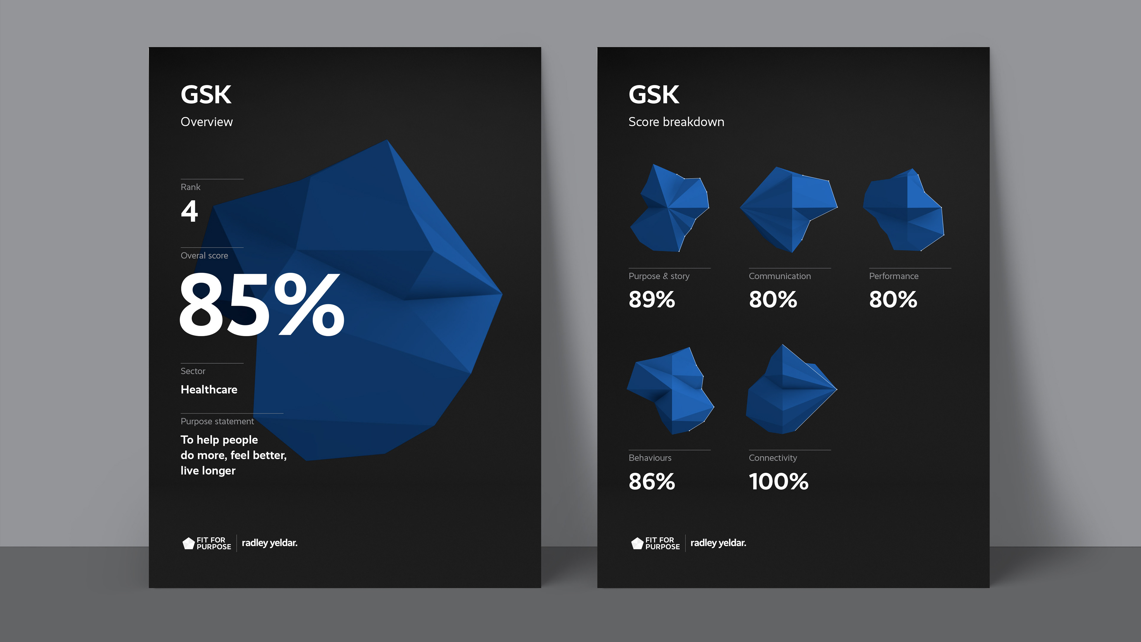
As part of a stage 2 concept, we wanted to take the top ten most purposeful companies and really explore the data behind their score. Taking the 3D data visualisations that was created for those companies as part of the campaign, and placing them on the dashboard, to become a fully interactive experience.
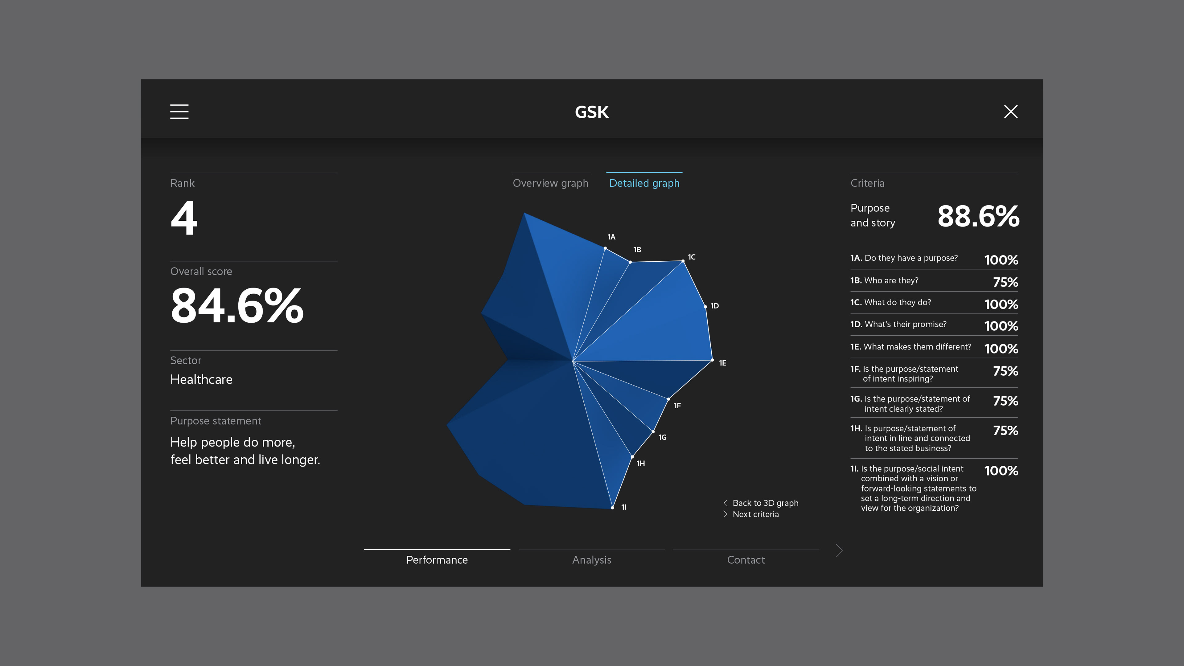
As part of the site, each categories has some analysis from RY's brand consultants, and an explanation as to how they came to this conclusion.